Since the debut of the Starbucks red cups in 1999, they’ve made quite an impression. There was the now-infamous red cup fiasco of 2015 when the coffee giant was accused of removing all signs of Christmas from their cups in a minimalist all-red ombre design as part of the so-called “War on Christmas.”
Every year, when they’re released, there’s a bit of hype and fanfare among fans of the coffee chain. The red cup designs have evolved over the years from the original candy apple red, and some of them were bigger hits than others. So we’ve taken it upon ourselves to rank all the designs the Starbucks Creative Studio has come up with from worst to best. Grab a latte, sit back, and enjoy.
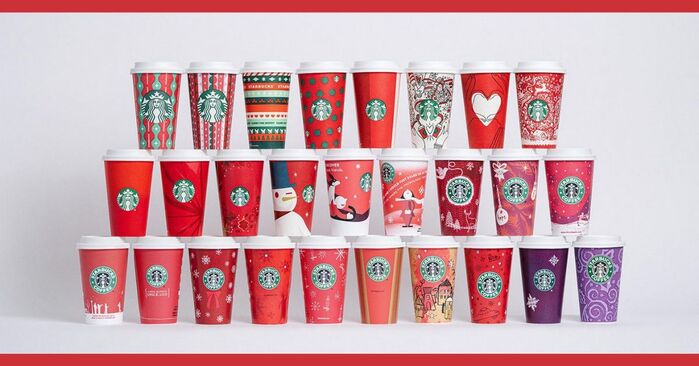
We’re not procrastinating our holiday shopping, why do you ask?
Starbucks Red Cups Ranked From Worst to Best
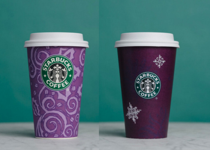
25. 1997 and 1998: Purple Cups
Before the premiere of the red cup in 1999, Starbucks used purple shades for their holiday cups. They were pretty, and purple is the color of royalty, but it’s not so much a “holiday” color unless that holiday is Halloween.
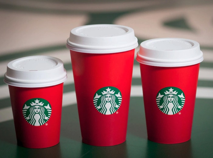
24. 2015: Ombre Red Cup
Look, we understand what Starbucks was trying to do here, and we respect it. But the cup was just boring. Minimalism has its time and place, but the holidays are all about being gaudy. Just ask our neighbor who blinds us every night with their light display.
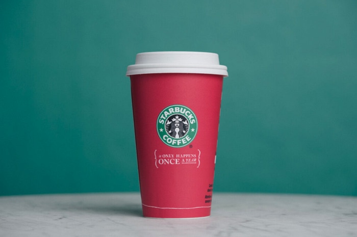
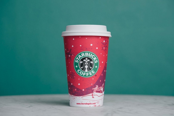
23. 2005: “It Only Happens Once a Year”
Something about this phrase is super ominous and vaguely threatening. What only happens once a year? Red cups? The holiday menu at Starbucks? Visiting the dentist?
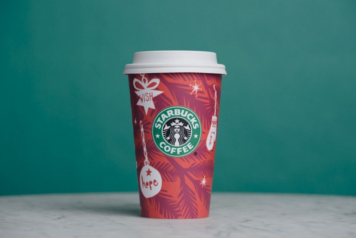
22. 2009: Ornaments
The year that Starbucks debuted the Caramel Brulée Latte was unfortunately also the year they went with this design. According to them, it’s supposed to be “paper cut ornaments hanging on sprigs of evergreen.” It looks to us more like a palm tree with clunky jewelry. Grandma, how’d you get on the design team?
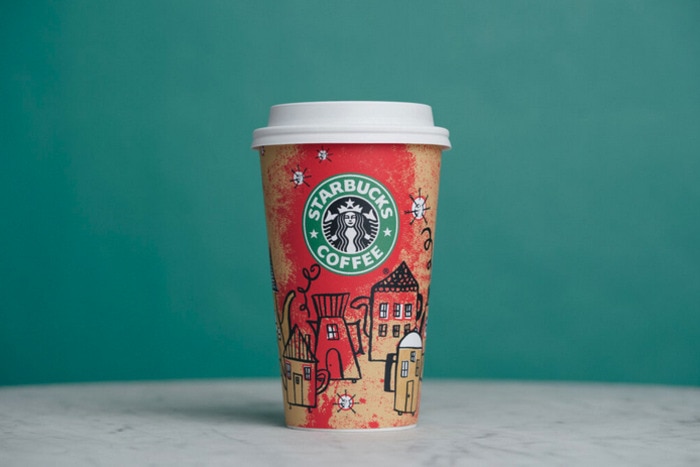
21. 2000: Coffeetown
This is the magical year that Starbucks invited the Gingerbread Latte to the menu. We’d like to pour that directly into our mouths and skip this odd cup, but reportedly that violates one too many food safety rules. Anyway, Starbucks says this design was supposed to be a village of tea kettles and coffee pots on a nighttime sky, but we’re getting “the cat got into the passion fruit tea again.”
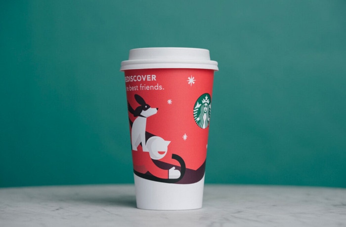
20. 2011: Modern Cups
From 2010 to 2012, the Starbucks Creative Studio focused on a Mid Century Modern inspired graphic style. The writing on each cup detracts from, rather than adds to, the overall aesthetic, and we want more detail. Recent cup designs have spoiled us maximalists.
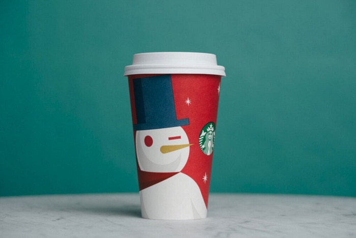
19. 2012: Snowman
We love a good Mid Century modern art piece, but this snowman doesn’t have much personality. It looks more like it’s got something in its eye. Therefore, we knocked it down a few pegs on this list, even though we really like snow people.
18. 2010: Carolers
We can all agree that carolers are better when they aren’t interrupting your nightly Gilmore Girls binge-watch. The final piece to this three-year puzzle that was the modern art period at Starbucks is our favorite of the three, but that’s not saying a whole lot. RIP to all the drinks that were spilled as folks turned over their cups to read the writing.
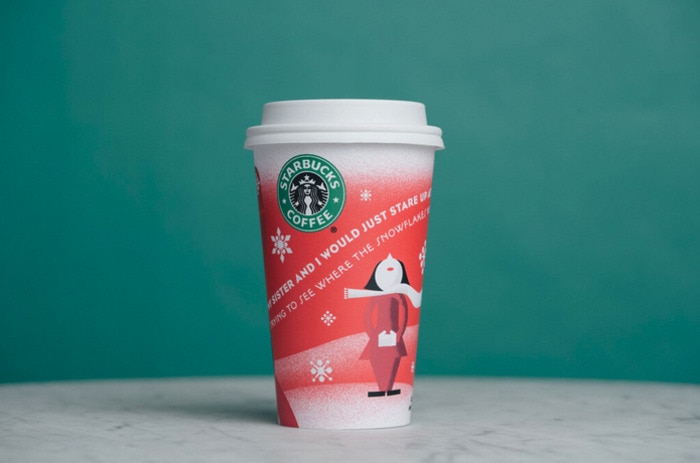
17. 2001: Green Stripes
The White Chocolate Mocha made its first appearance in these red cups trimmed with green vertical stripes, meant to look like Christmas present wrapping. It’s an okay design, albeit lackluster. Our recommendation: add biodegradable glitter.
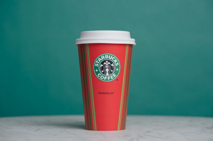
16. 2014: “Let There Be Bright”
Simple cranberry-toned brushstrokes adorn this red cup. Simple, classic, nothing to write home about. Hence why we’re writing online instead.
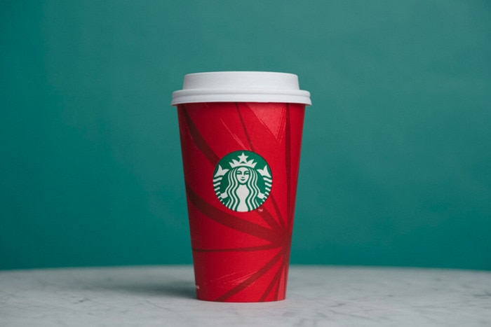
15. 2013: Gold-Garnished Red Cup
This embellished design gives the holiday cups a retro feel thanks to the vintage ornaments and gold accents. Pretty and understated, perfect for the middle of the pack.
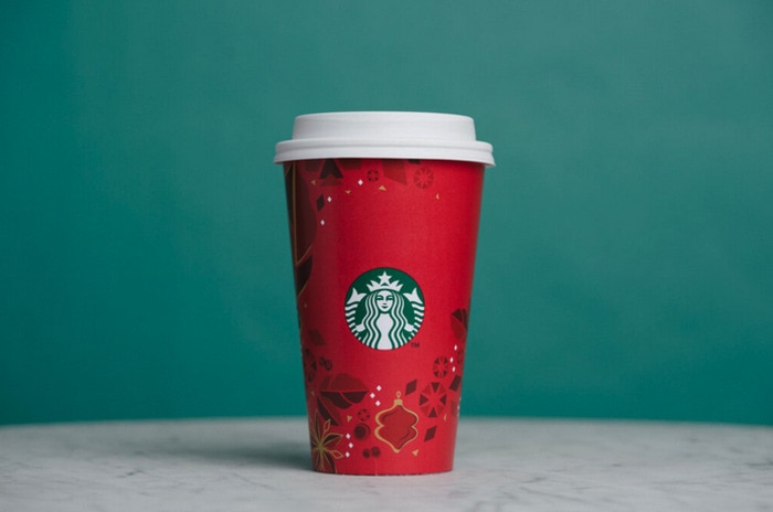
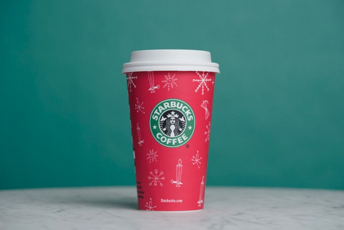
14. 2002: Candlestick Line Art
This was the first to feature white line art, which later became a staple on Starbucks red cups. With candlesticks, doves, and snowflakes, it’s a cute design evoking an old-school Christmas feel. It’s not the best cup on the list, but it’s also not the worst. If only our peers thought that about us in gym class.
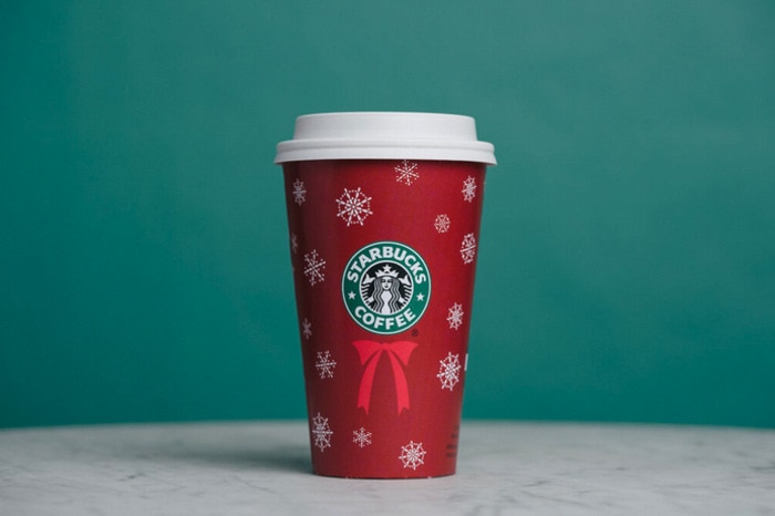
13. 2004: Starbucks Wreath
It only took Starbucks five years to realize their logo looked like a wreath and create a classic design with snowflakes falling around the focal point. And, thanks to the Grinch, we know there’s more than meets the eye when it comes to snowflakes.
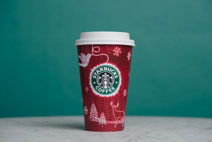
12. 2008: Woodland Landscape
We would like this design a lot more if they went without the knitted background texture, which detracts from the dove and deer elements. It just goes to show that more isn’t always more, except when it comes to pumps of peppermint syrup in our coffee.
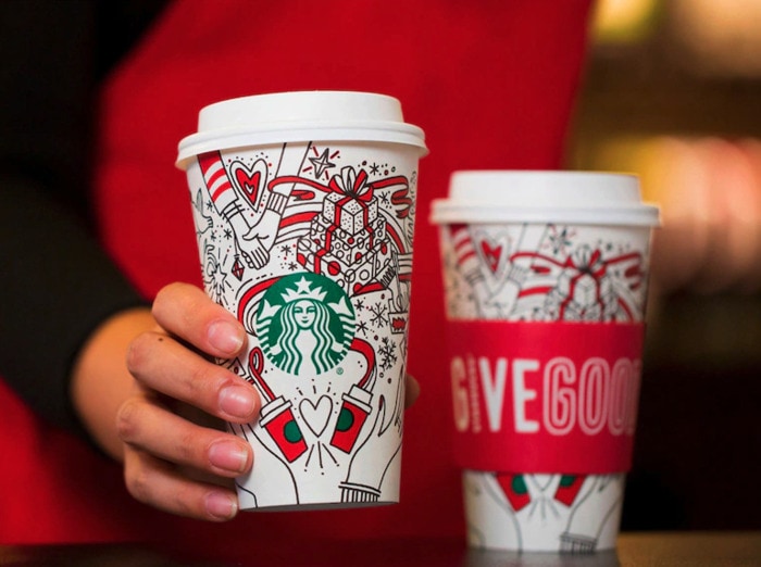
11. 2017: White Cup
So, it’s white. Now that the obvious is out of the way, the goal of the cup was for customers to add their own flair by coloring in the line drawings. It’s a fun idea, but how many people carry crayons with them on the go? Yeah, okay, besides us.
10. 2006: Holiday Tableaux
You might be surprised by this cup’s high position on our list, but the more we looked at it, the more we liked the design. It makes us feel all warm and fuzzy inside. No credit will be given to the cup of hot cocoa we’re drinking.
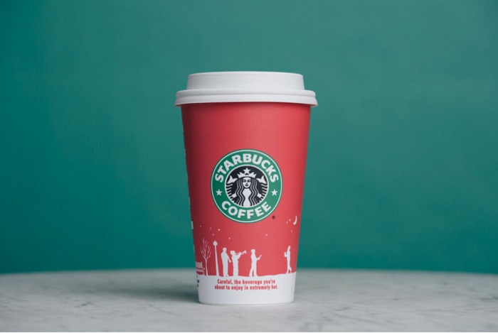
9. 2020: “Carry the Merry”
The four cups Starbucks debuted in 2020 include classic Christmas colors in various shades of red and green. They include some more modern design elements like bold colors and simple patterns without the intricate details of former years, but it works. They’re jolly enough for even the Scroogiest person you know.
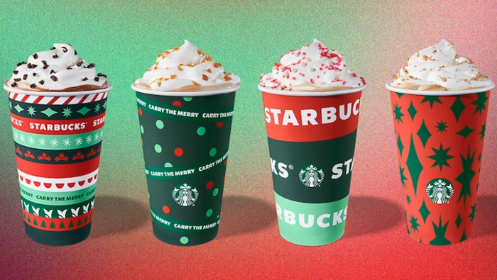
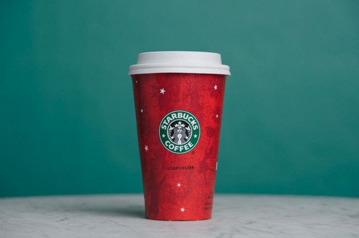
8. 1999: The OG Red Cup
Props must be given to the original. Even though the car at the bottom looks like a UFO, we like this cup. It feels authentic to the brand, and paved the way for all the cups that came later.
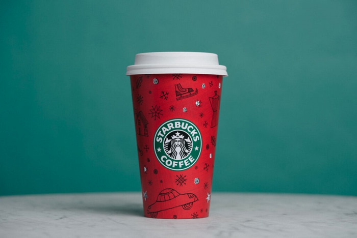
7. 2018: Red and Green
This year marked the beginning of a new wave of designs for the brand, and on the whole, we like the direction. The four different cup designs include one with a green base, one with white, and two red cups. The only problem is that we like them as a unit more than individually. Body, prepare to be highly caffeinated.
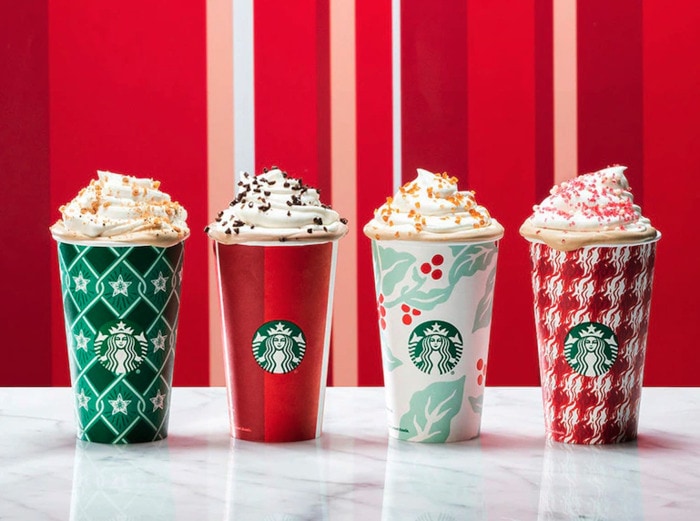
6. 2003: Shimmering Stars Cup
From afar, it looks like a sunset on Mars. But, up close you can see the details of snowflakes and holiday dancers. It’s Starbucks’ most successful attempt at a minimalist cup design to date, and the sense of nostalgia it invokes is making us all teary-eyed. Oh wait, nope, that’s just the rover kicking up dust again.
5. 2021: Lavender Highlights
For the first time since 1998, Starbucks added hints of purple to the cups. In an ongoing trend for the brand, they came out with four different patterns. They’re busy, but festive, with extra branding weaved throughout that has become commonplace on their cups in recent years.
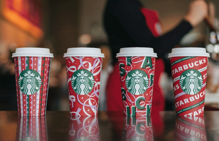
4. 2022: Tree Designs
Evergreen trees adorn several of the designs on this 2022’s holiday cups. They feel like classic Starbucks without trying too hard, and we aren’t as overwhelmed by the aesthetic as we have been in other years. Now the only thing to overwhelm us will be deciding which holiday drink to order.
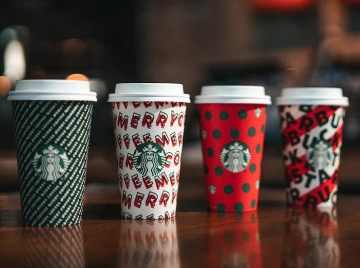
3. 2019: Merry Coffee
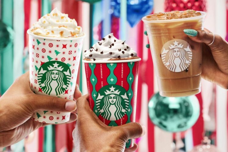
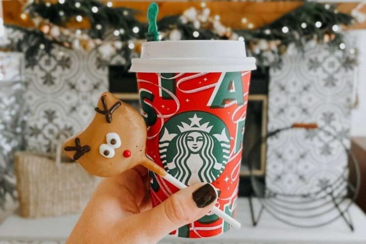
Some of our favorite holiday cups came out in 2019, with four options featuring polka dots, cool lettering, and a very “more is more” approach. We’re pretty sure the one with candy cane stripes was the original Wordle.
2. 2007:”Pass the Cheer”
The brand hit its design stride in 2007. The snowy scene is sentimental, fun, and evokes warmth. For the 10th anniversary of holiday cups, we’d expect nothing less. Though maybe some tin would be nice.
1. 2016: 13 Days of Starbucks Cups
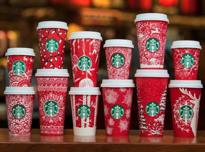
Thirteen designs for cups were released in 2016, and they were created by customers from six different countries. It was peak ingenuity, and it made for a fun surprise every time you ordered. We’ll drink coffee in just about any receptacle, but these ones were hands-down our favorites.
- 25 Summer Wedding Guest Dress Options That *Probably* Won’t Upstage the Bride - July 3, 2024
- 50 Valentine’s Day-Inspired Rooms to Use for Decorating Inspiration - February 9, 2024
- Shake Up One of These 27 Romantic Valentine’s Day Cocktails This Week - January 16, 2024

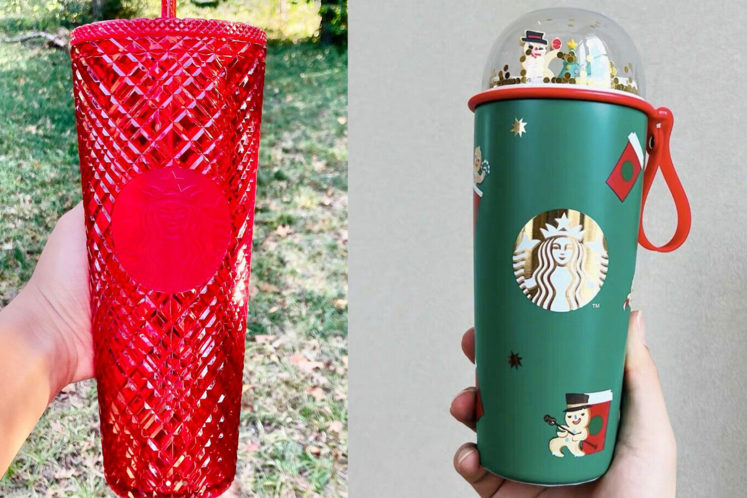
I really love the designs of the 13 days of cups. I think it’d be a great idea to have a holiday cup design from customers for every year instead of a design team trying to create a “vibe” or “mood”. It was a very good choice after their fiasco of the solid red cup of 2015.